Charts and Graphs
Create a chart
Select the data for which you want to create a chart.
Click INSERT > Recommended Charts:

On the Recommended Charts tab, scroll through the list of charts that Excel recommends for your data, and click any chart to see how your data will look.
If you don’t see a chart you like, click All Charts to see all the available chart types.
When you find the chart you like, click it > OK.
Use the Chart Elements, Chart Styles, and Chart Filters buttons, next to the upper-right corner of the chart to add chart elements like axis titles or data labels, customize the look of your chart, or change the data that is shown in the chart.
To access additional design and formatting features, click anywhere in the chart to add the CHART TOOLS to the ribbon, and then click the options you want on the DESIGN and FORMAT tabs.
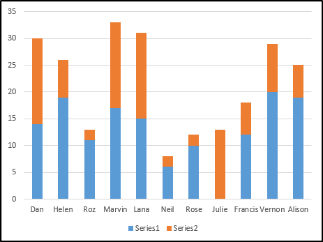
Bar chart
1. Make sure your data is laid out in a table format:
![]()
2. Select the data (including the column headers) and click the recommended charts button. If you have multiple series of data you can select them all at once, or you can select the 1st series and add the 2nd later.
3. Select a horizontal or vertical bar chart:
![]()
4. Add any extra series of data if you need them:
- right click the graph and select 'select data...' :

- Under the Legend Entries (series), click 'add':

- You can then reference the series name and the data:

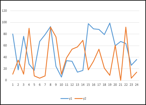
Line or Scatter Chart
1. Make sure your data is laid out in a table format, with the X-axis as either numeric or date format:
![]()
2. Select the data (including the column headers) and then select the recommended charts button. If you have multiple series of data you can select them all at once, or you can select the 1st series and add the 2nd later.
3. Select a Line chat or Scatter chart from the list and click ok:
![]()
4. Series can be added or removed the same as the bar charts.
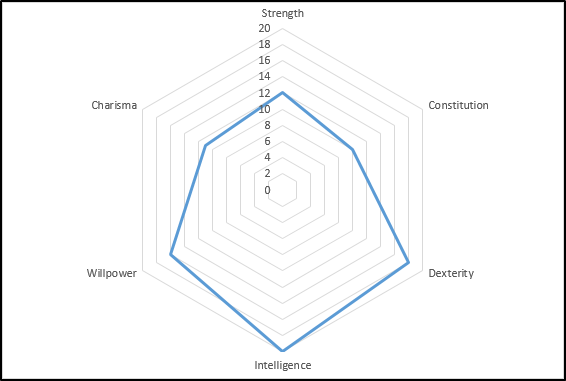
Radar
1. Lay out your data in a table format with each category of data listed next to the value:
![]()
2. Select the data by clicking and dragging around it. You can select further series of data simultaneously if you wish to add more than one series. Once selected, choose the recommended charts button and go to the 'all charts' tab:
![]()
Pie Charts

1. Lay out the data in a table:
![]()
- If your data is in log format you will need to collate the values into their totals using a =CountIF function
2. select the collated data and then click the recommended charts button:
![]()
Sunburst
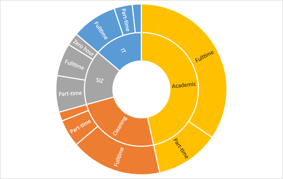
A sunburst is like a pie chart, except that it has a secondary level of categorisation. So you can break down a 1st level category into a subsection of the 2nd level category as Is shown in the image above.
1. First we must make a table of the data:
![]()
- Notice how the secondary category is listed after the department, before the value/total column.
2. Select the data by clicking and dragging and then click the recommended charts button, you'll find sunburst under 'all charts':
![]()
Waterfall

A Waterfall chart is used to show change over time. Therefore you will need to calculate the change between the values you have to insert into the table.
1. Calculate the change values and place them into the table of data:
![]()
2. highlight the time values and the change values. If these are in non-adjacent columns you will need to click and drag one column, before holding ctrl and clicking and dragging the second column:
![]()
3. Once the relevant columns has been selected go to the recommended charts button and select 'all' and then finally, Waterfall:
![]()