If you know that you are working with someone with dyslexia, please make sure you discuss with them how they like to work and if they have any specific requirements.
Whilst not all people are the same, here are some good general tips:

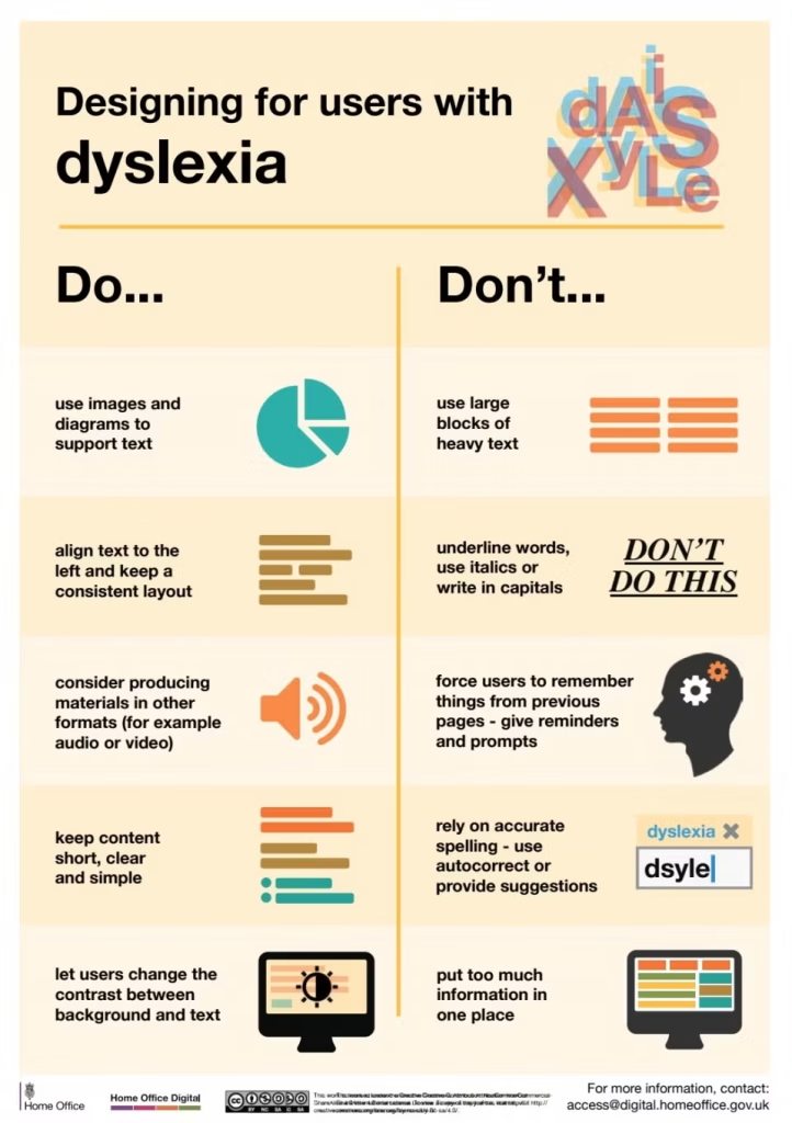
Designing for users with dyslexia
- Do use images and diagrams to support text
- Don’t use large blocks of heavy text
- Do align text to the left and keep a consistent layout
- Don’t underline words, use italics or write in capitals
- Do consider producing materials in other formats (for example audio and video)
- Don’t force users to remember things from previous pages – give reminders and prompts
- Do keep content short, clear and simple
- Don’t rely on accurate spelling – use autocorrect or provide suggestions
- Do let users change the contrast between background and text
- Don’t put too much information on one page
