If you know that you are working with someone who is on the autistic spectrum, please make sure you discuss with them how they like to work and if they have any specific requirements.
Whilst not everyone is the same, here are some good general tips:
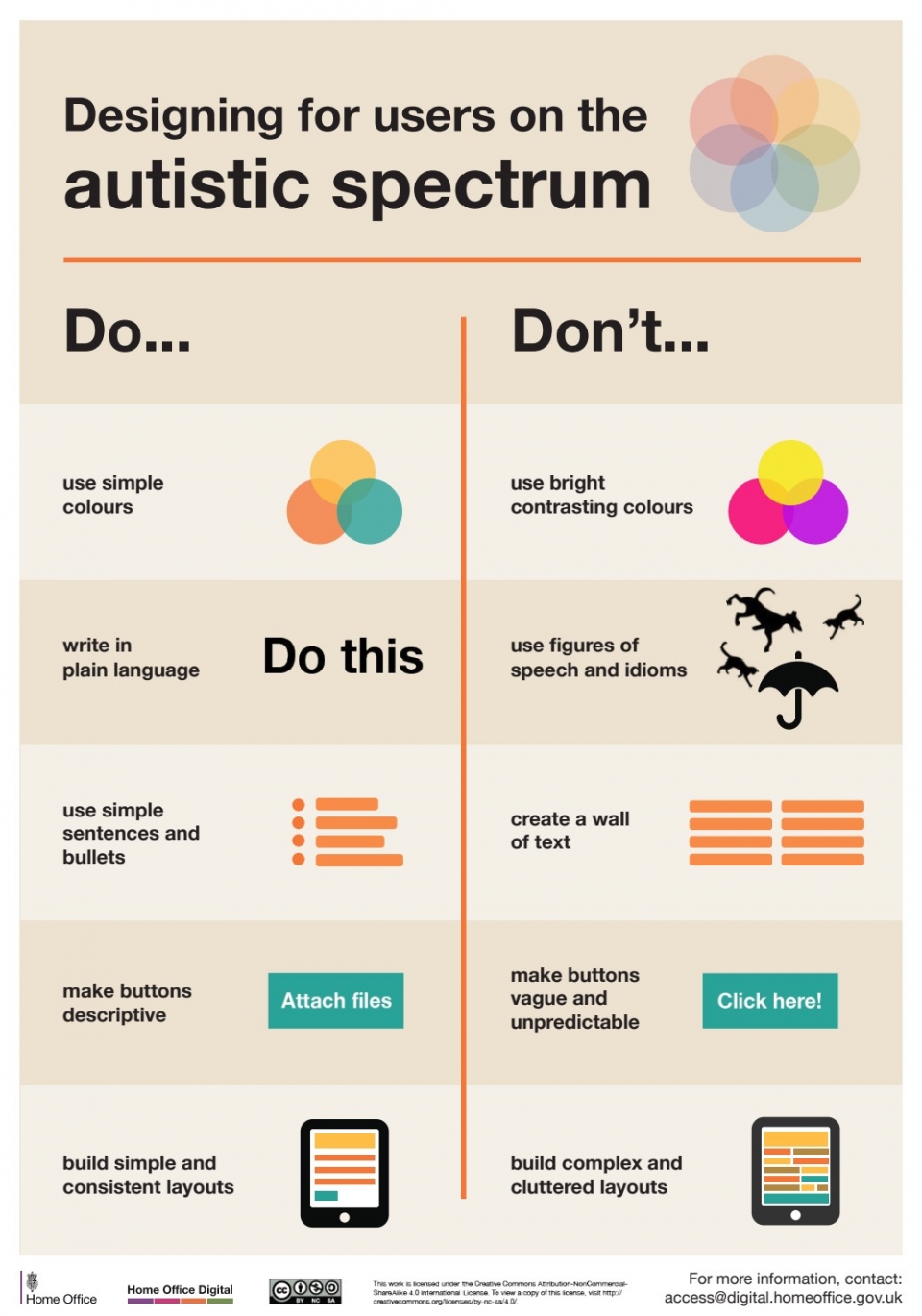
Designing for users on the autistic spectrum
- Do use simple colours
- Don't use bright contrasting colours
- Do write in plain language
- Don't use figures of speech or idioms
- Do use simple sentences and bullets
- Don't create a wall of text
- Do make buttons descriptive
- Don't make buttons vague and unpredictable
- Do build simple and consistent layouts
- Don't build complex and cluttered layouts


