If you know that you are working with someone with a visual impairment, please make sure you discuss with them how they like to work and if they have any specific requirements.
Whilst not all visually impaired people are the same, here are some good general tips:
Communication tips:
- Introduce yourself by name when greeting someone who is visually impaired
- If someone else is with you or joins you during a conversation, introduce them by name too
- Use the visually impaired person’s name to get their attention before addressing them
- Talk directly to the person you are addressing, not to their guide or whoever is with them
- Speak clearly and at your normal pace, using natural facial expressions and gestures, as these inform your tone
- Avoid leaning in too close — place yourself at an easy and audible distance
- Ask questions. For a visually impaired person, their blindness is not a taboo
- Ask before moving their possessions and before petting their working guide dog
Delivery tips:
- Allow the visually impaired person to choose where they sit in the room — they may need to be at the front in order to hear you effectively
- Minimise background noise for the best listening experience
- Reduce clutter and obstacles in the room
- For smaller teaching groups, indicate who is present in the room at the start of the session and acknowledge anyone who joins or leaves the session by name
- Provide all text materials in an accessible electronic format, such as Word. A visually impaired person may need files to be compatible with assistive software such as screen reader, magnifier and/or Braille reader
- Consider creating your text files in Word, using a ‘sans serif font such as Arial, using left alignment and clear headings. Avoid using italics and underlining, as much as possible. Provide alternative text for all images, diagrams and charts
- Provide all printed materials in accordance with the visually impaired person’s print requirements i.e. large print, colour paper. Avoid printing on glossy paper. Upload lecture capture via Teams
- Provide reading lists well in advance of the start of the semester or module to allow time to source alternative formats
- Provide session content and PowerPoint files at least 24 hours prior to the session
- Provide full verbal commentary of visual demonstrations or any diagrams or charts that may be shown (one-to-one sessions may be necessary). SensusAccess file conversion service may be useful
- Encourage inclusivity in sessions, providing opportunities to work with everyone and ensuring that group work activities are accessible i.e. avoid task writing on a large sheet.
- Ensure all teaching staff and visiting staff are aware of the visually impaired person’s needs

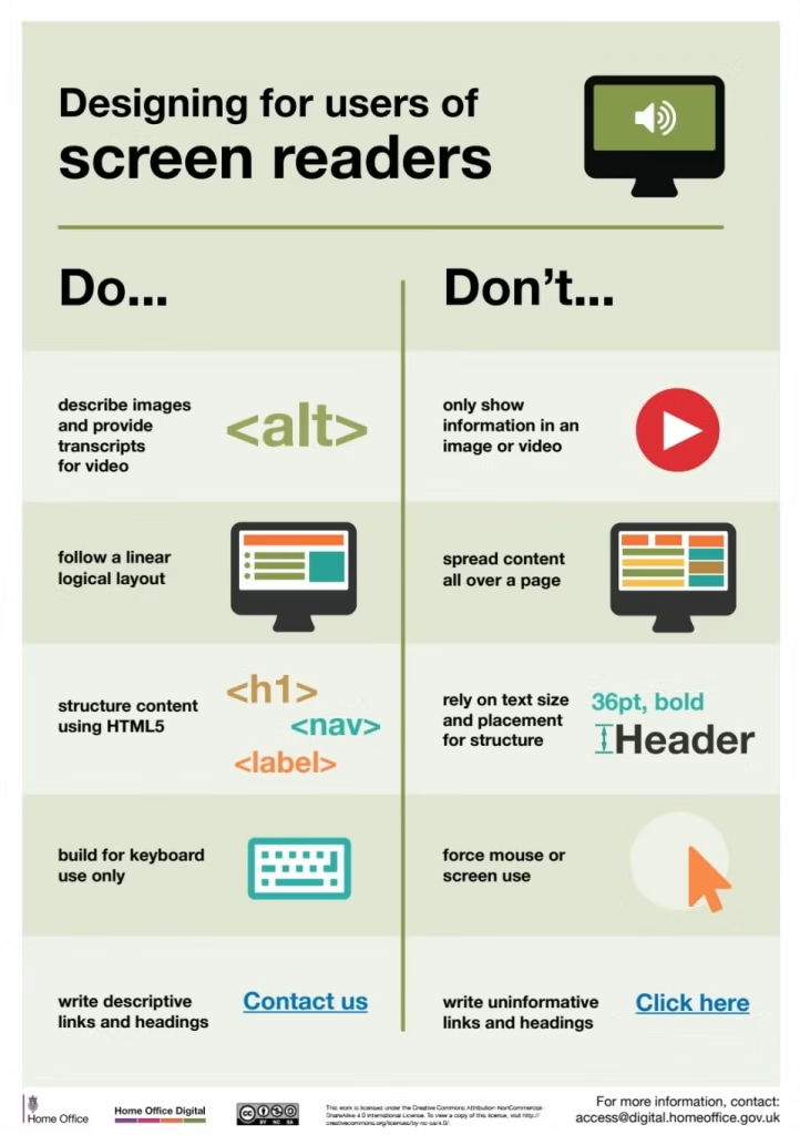
Designing for users of screen readers
- Do describe images and provide transcripts for video
- Don’t only show information in an image of video
- Do follow a linear logical layout
- Don’t spread content all over the page
- Do structure content using HTML5
- Don’t rely on text size and placement for structure
- Do build for keyboard use only
- Don’t force mouse or screen use
- Do write descriptive links and headings
- Don’t write uninformative links and headings

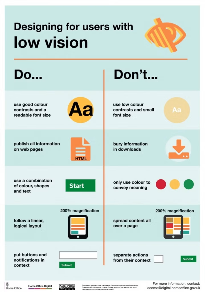
Designing for users with low vision
- Do use good colour contrasts and a readable font size
- Don’t use low colour contrasts and small font size
- Do publish all information on web pages
- Don’t bury information in downloads
- Do use a combination of colour shapes and text
- Don’t only use colour to convey meaning
- Do follow a logical linear layout
- Don’t spread content all over a page
- Do put buttons and notifications in context
- Don’t separate actions from their context
