Creating Charts & Graphs in Excel
Excel lets you transform rows and columns of data into insightful visuals. Use charts to make trends, comparisons, and patterns instantly clear. Here’s how to create and customize a variety of chart types.
Step 1: Prepare Your Data
- Organize your data in a clear table format, including headers for each column.
- Ensure that each column represents a single data series (e.g., sales amounts, dates, categories).
- Avoid mixing incompatible formats (e.g., text and numbers) in the same column.
Picture

Step 2: Insert a Chart
- Select the data you want to visualize, including headers.
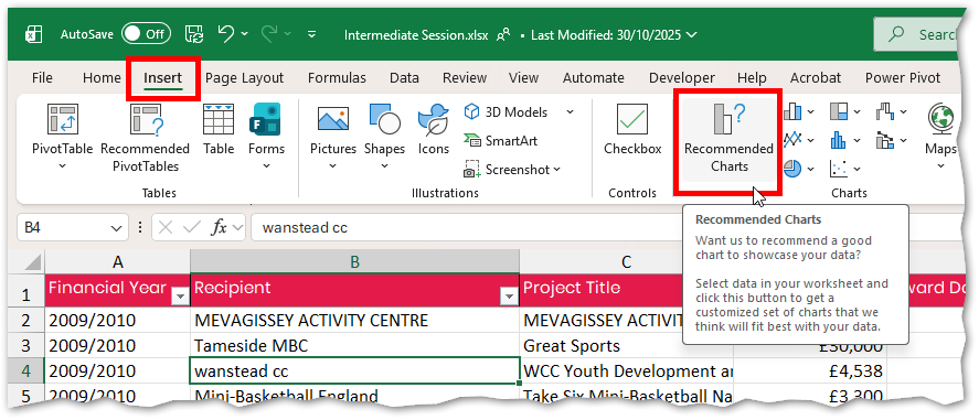
- Open the Insert tab and click Recommended Charts.
- On the Recommended tab, hover over any suggestion to preview it.
- If nothing suits, select All Charts to explore every option.
- Click the desired chart and press OK.
Excel will insert it onto your worksheet
Picture
Step 3: Customize with Chart Tools
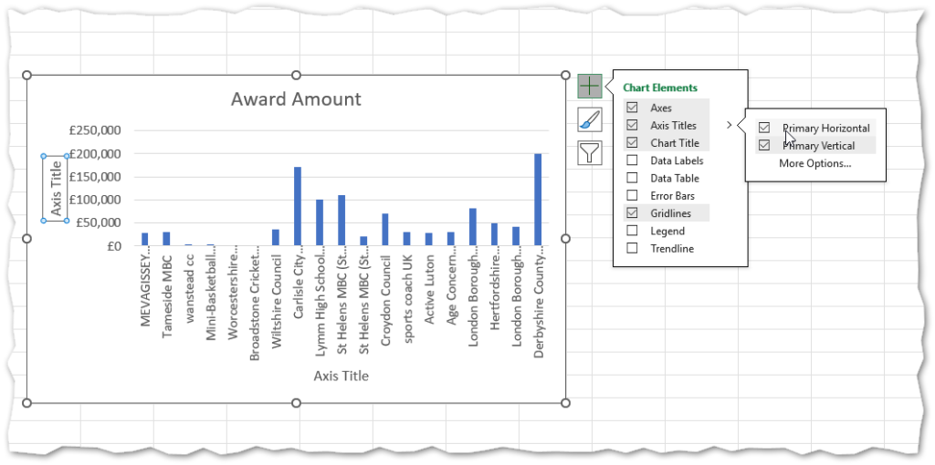
Click the chart to activate additional tools:
- Chart Elements: Add titles, data labels, gridlines, axes, and legends.
- Chart Styles: Choose color schemes and overall chart looks.
- Chart Filters: Control which data series or categories are visible.
- Design & Format Tabs: Access advanced formatting and layout adjustments.
Picture
Step 4: Chart-Specific Setup
- Bar Charts:
- Ensure headers are included.
- Insert a clustered or stacked bar/column chart.
- To add another series: right-click the chart > Select Data… > Add under Legend Entries (Series).
Picture

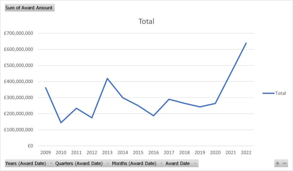
- Line or Scatter Charts:
-
- Suitable for numeric or date-based X-axis.
- Insert via Recommended Charts.
- Use Select Data… to fine-tune series
Picture
- Radar Chart:
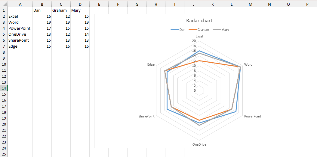
- Set data up with category names and values per row.
- Select range, go to All Charts, and choose Radar
Picture
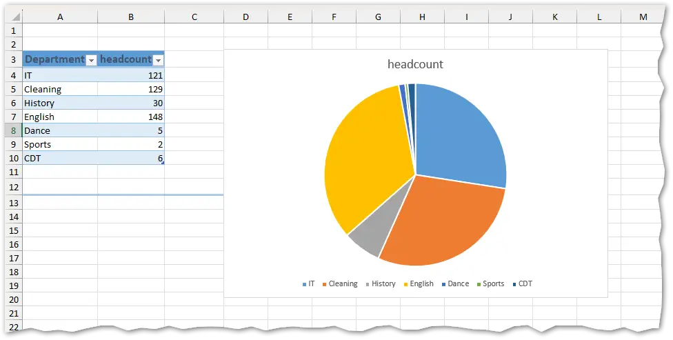
- Pie Chart:
- Organize your data in two columns: category and value.
- If using log-format data, pre-aggregate with
=COUNTIForSUMIF. - Select the summary table and insert a Pie chart.
Picture
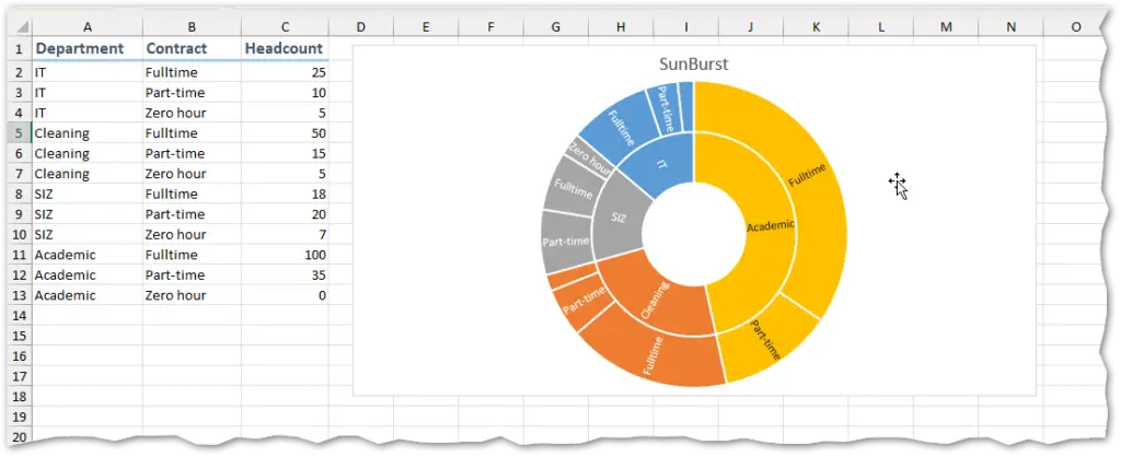
- Sunburst Chart:
- Prepare data in hierarchical order: primary category, secondary category, then values.
- Select the full table, go to All Charts, and pick Sunburst.
Picture
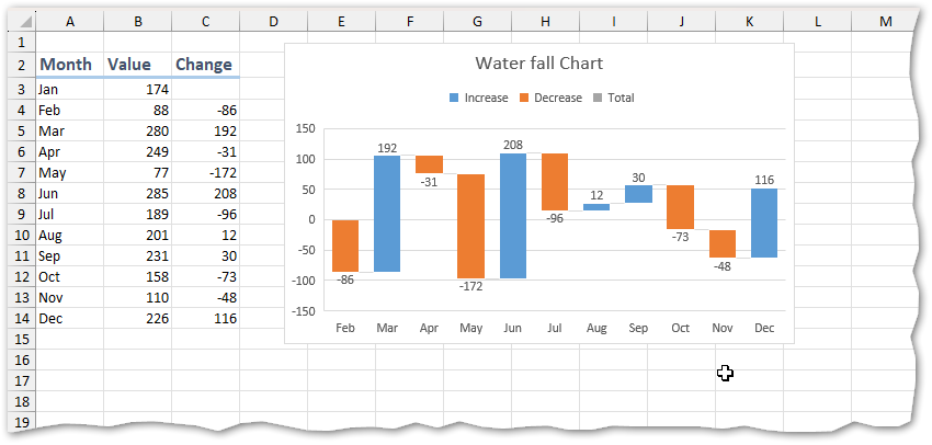
- Waterfall Chart:
- Calculate changes over time in your data table.
- Select the time and change columns (use Ctrl-click for non-adjacent columns).
- Go to All Charts via Recommended Charts, and choose Waterfall.
Picture
Step 5: Advanced Options
- Add or remove data series by right-clicking the chart and selecting Select Data.
- Change the calculation or grouping using Chart Filters.
- Apply trendlines for analysis (right-click a data series → Add Trendline).
- Use combo charts for complex data comparisons.
